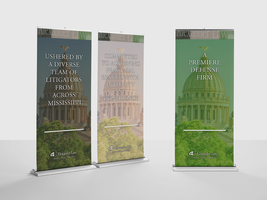

Alexander Law PA.
The Challenge.
Alexander Law, P.A. was entering a transitional period in its growth. Owner and Principal Attorney Amanda Green Alexander was intentionally positioning the firm to attract larger business and corporate clients, but its existing visual presence didn't fully reflect the level of professionalism, sophistication and experience needed to support that direction.
With an established logo already in place, the challenge wasn't to reinvent the firm's identity. It was to develop a stronger brand visual system around it, one capable of elevating how Alexander Law presented itself across print, digital, and client-facing communications.
The Solution.
That Creative Guy developed a refreshed brand visual direction around Alexander Law's existing logo, beginning with research into how firms serving similar corporate markets positioned themselves visually.
The color green, which held personal significance for Attorney Alexander, became a foundation for the expanded palette. It was paired with white, dark gray and taupe to create a sophisticated visual environment that complemented the existing identity while helping the firm communicate a more polished, corporate presence.
That Creative Guy also oversaw the photography direction and extended the new visual system across print collateral, advertising, large-format graphics and digital applications. The result was a more cohesive and elevated brand presence designed to support Alexander Law's transition toward larger business and corporate clientele, without unnecessarily replacing the equity of its existing logo.
Deliverables.
• Brand Visual Strategy
• Creative Direction
• Brand Color & Visual System Development
• Photography Art Direction
• Advertising Design
• Print Collateral
• Large-Format Display Graphics
• Banner Design
• Digital / Web Brand Visuals
• Supporting Brand Assets
Existing logo provided by client.