Hamp's Seed.
The Need.
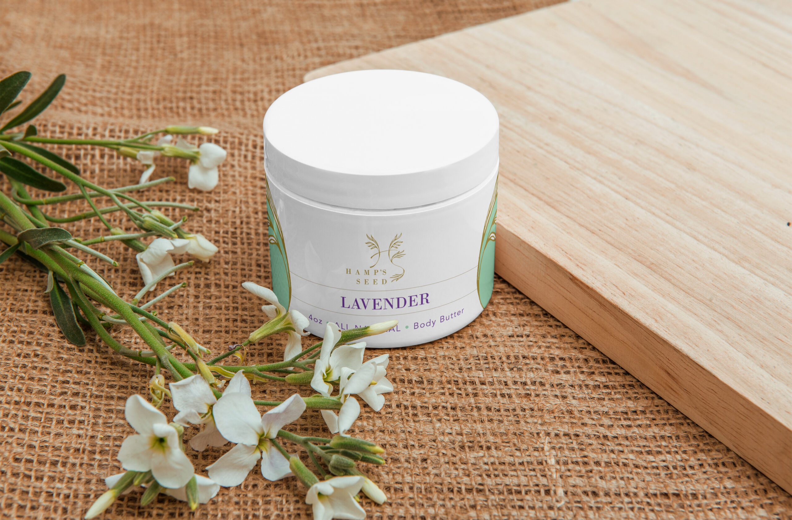
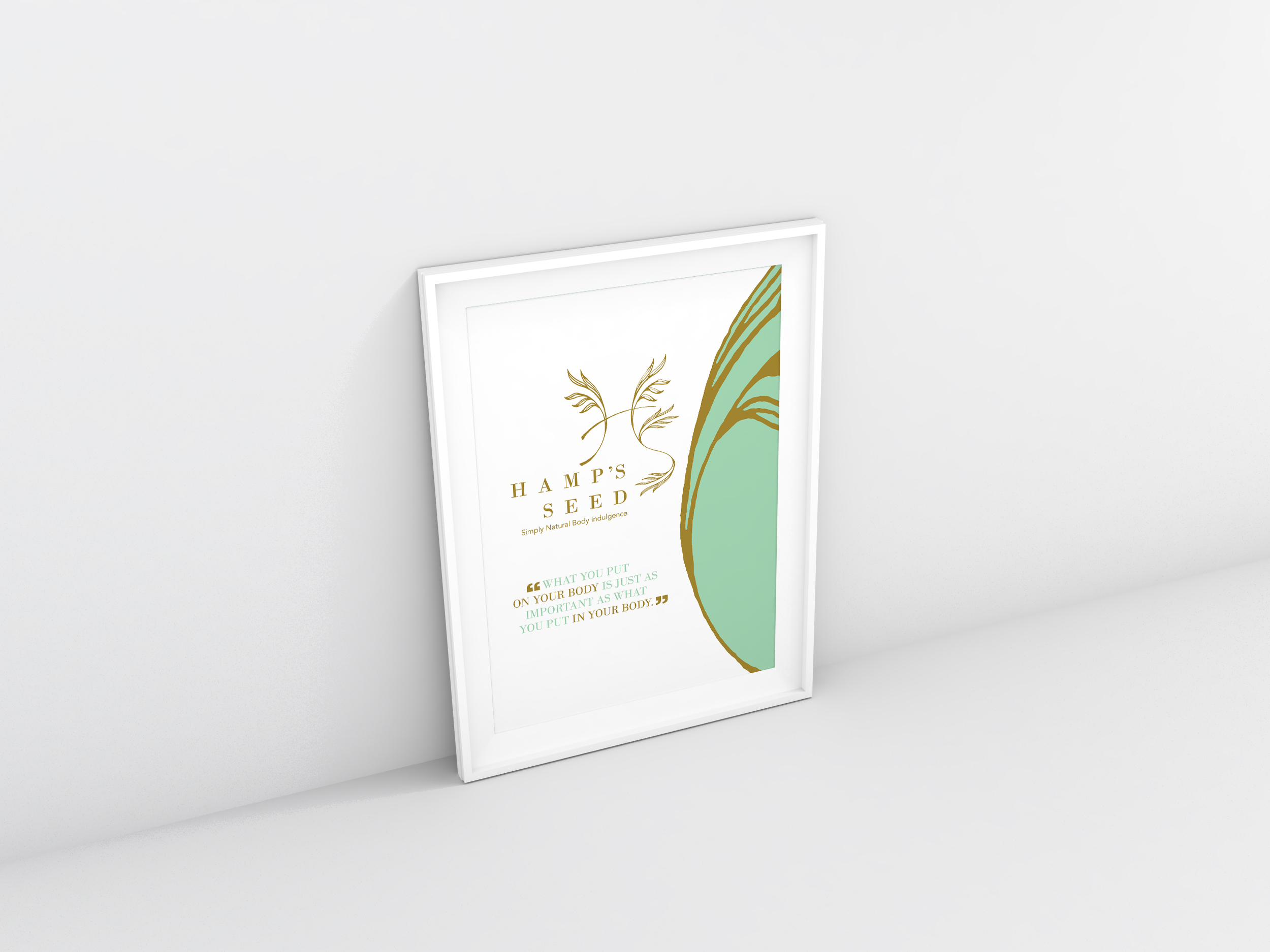
Following the development of Hamp's Seed's overall brand visual identity, the growing product line needed packaging that could carry that same visual language directly to customers.
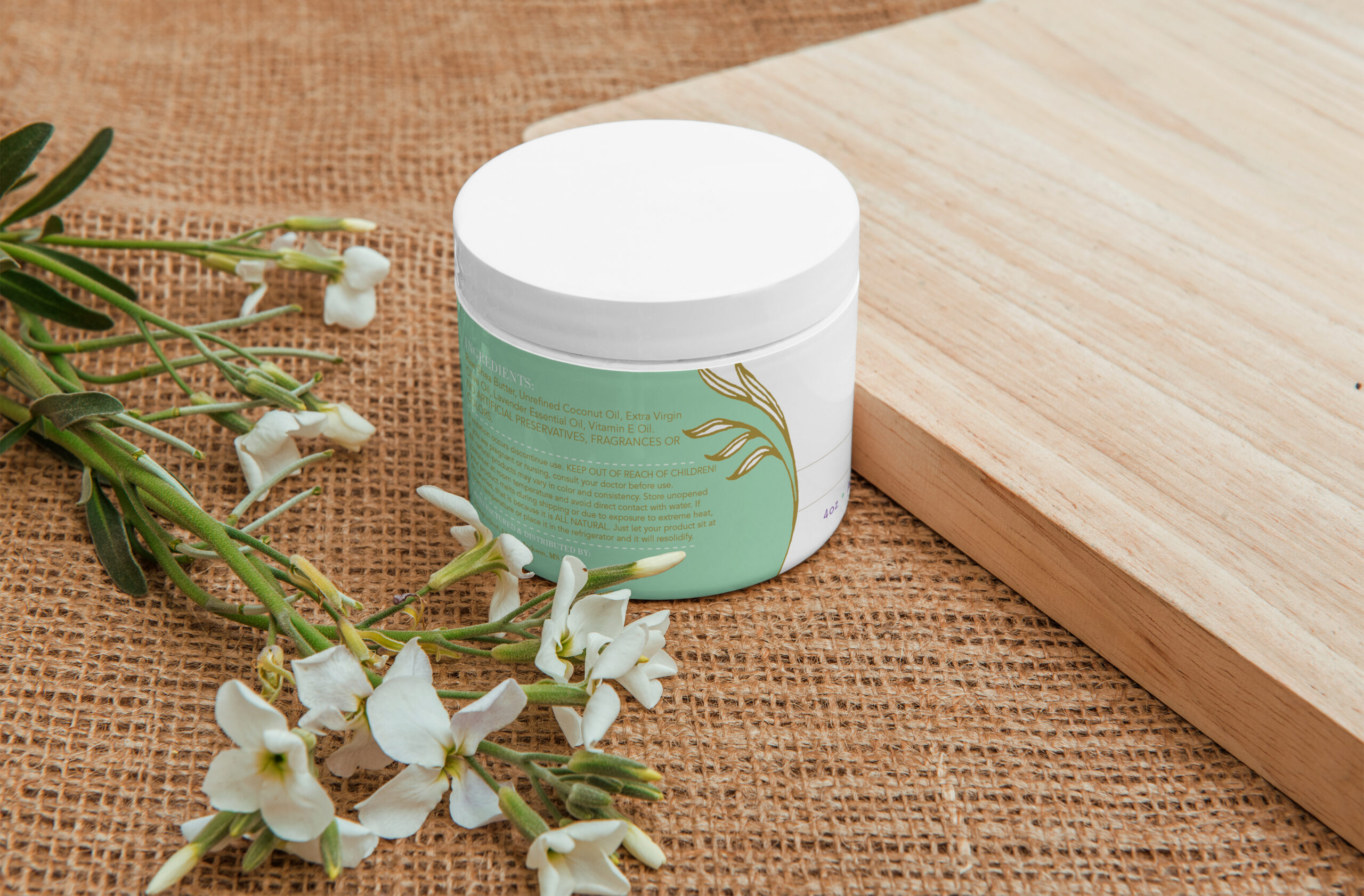
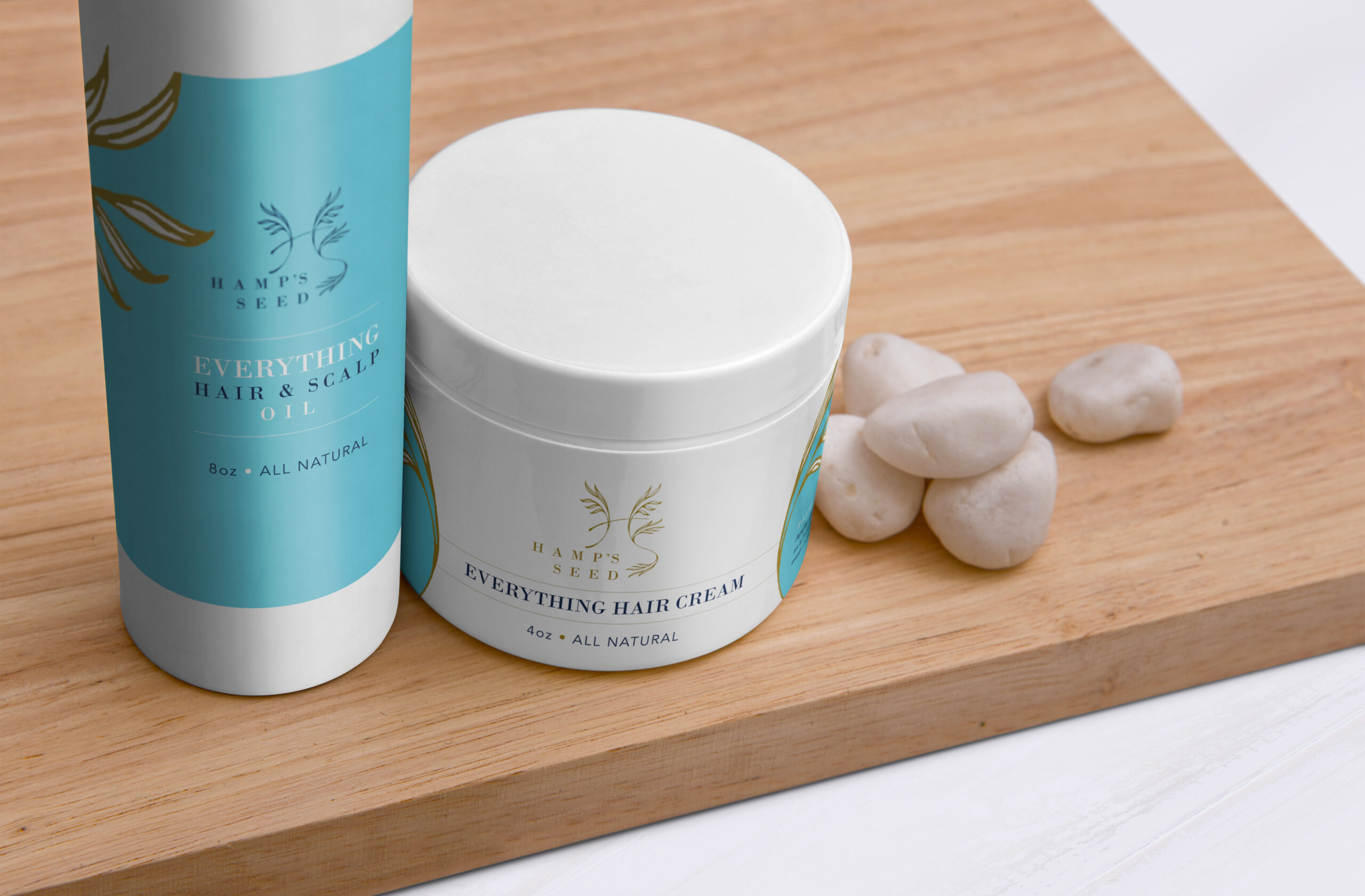
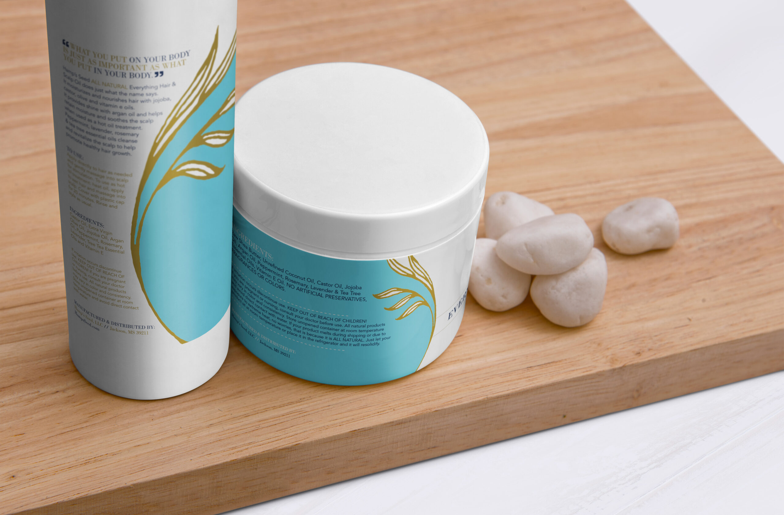
With a variety of bottles and containers across the line, the labels needed to clearly identify the products while maintaining a consistent, recognizable presence that reflected the natural and handcrafted qualities of the Hamp's Seed brand.
The Approach.
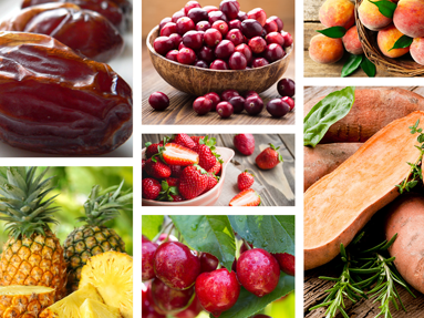
Building from the brand visual system previously developed for Hamp's Seed, That Creative Guy created a coordinated series of product labels using the established color palette, typography and visual direction. The label system incorporated organic, clean, simple and conceptual visuals, creating enough flexibility to distinguish individual products while ensuring the collection remained visually connected as one brand.
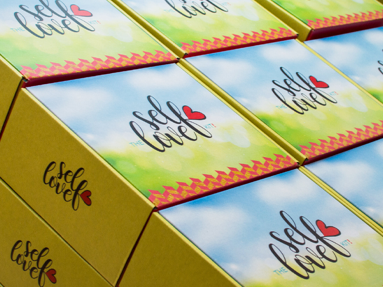
The packaging also became part of a larger customer experience. Owner Alicia Netterville developed custom mailer boxes that complemented the branded containers, creating an intentional unboxing experience for customers. Together, the labels and packaging helped extend the Hamp's Seed identity from its marketing materials directly into the customer's hands.
• Product Label Design
• Packaging Visual Direction
• Existing Brand Application
• Product-Line Visual Consistency
• Typography & Information Hierarchy
• Bottle & Container Label Systems
• Print-Ready Label Production